[ 008 ]
Discovery Health ID
Client
Discovery
Year
C. 2019
Discipline
Product
Healthcare
Status
Delivered
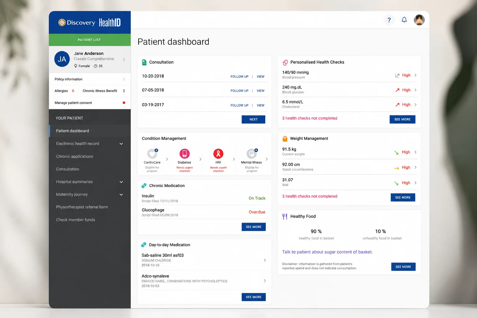
Health ID gives healthcare professionals access to patient information within a connected clinical environment. The design problem is characteristic of clinical software: the depth of information cannot be reduced, but the effort of finding a specific fact within it can.
Practitioners typically consult the platform during a consultation, with the patient present. That context sets the constraint — the interface has to be scannable in seconds and predictable enough to use without looking for things.
My Role
Solo UX/UI Designer. Solo designer on the product, responsible for end-to-end UX and UI — including clinical information architecture, progressive disclosure, navigation patterns and the final interface for practitioner use.
The UX approach
The patient record is structured around how a clinician builds a picture: identity and current status first, then history, medication and results, then administrative and scheme detail. Position is stable across every patient, so location is learned once and never re-searched.
Depth is preserved through progressive disclosure rather than removed. Summary views carry the fact; the full record sits one predictable step behind it, so nothing is lost to simplification.
Navigation is kept shallow and consistent, and destructive or clinically significant actions are separated from routine ones to prevent errors made at speed.
The UI approach
Typographic hierarchy does most of the work: a restrained scale, strong label-to-value contrast, and tabular alignment so results and medication lists can be scanned vertically rather than read.
Colour is functional only — flags, status and severity — leaving the rest of the interface neutral so clinical signals stand out. Generous spacing separates information groups without adding chrome, and components are reused consistently across record types so unfamiliar sections still behave predictably.