[ 005 ]
RIOT Insight
Client
RIOT Insights
Year
C. 2018
Discipline
Product
In-store Device
Material
Status
Delivered
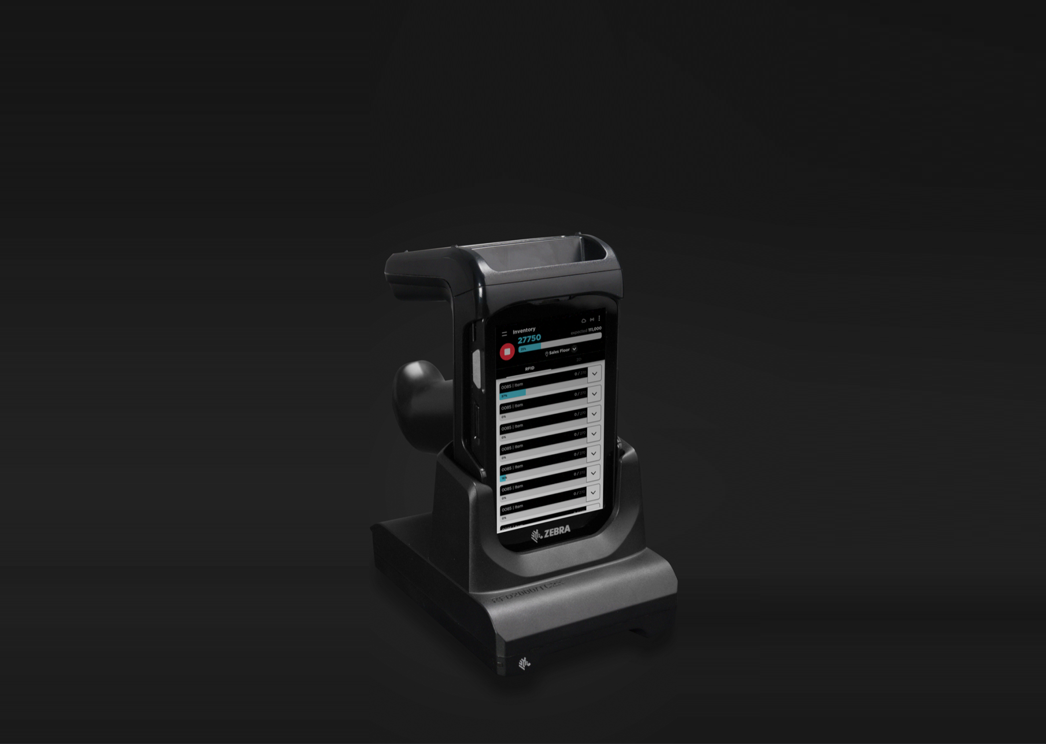
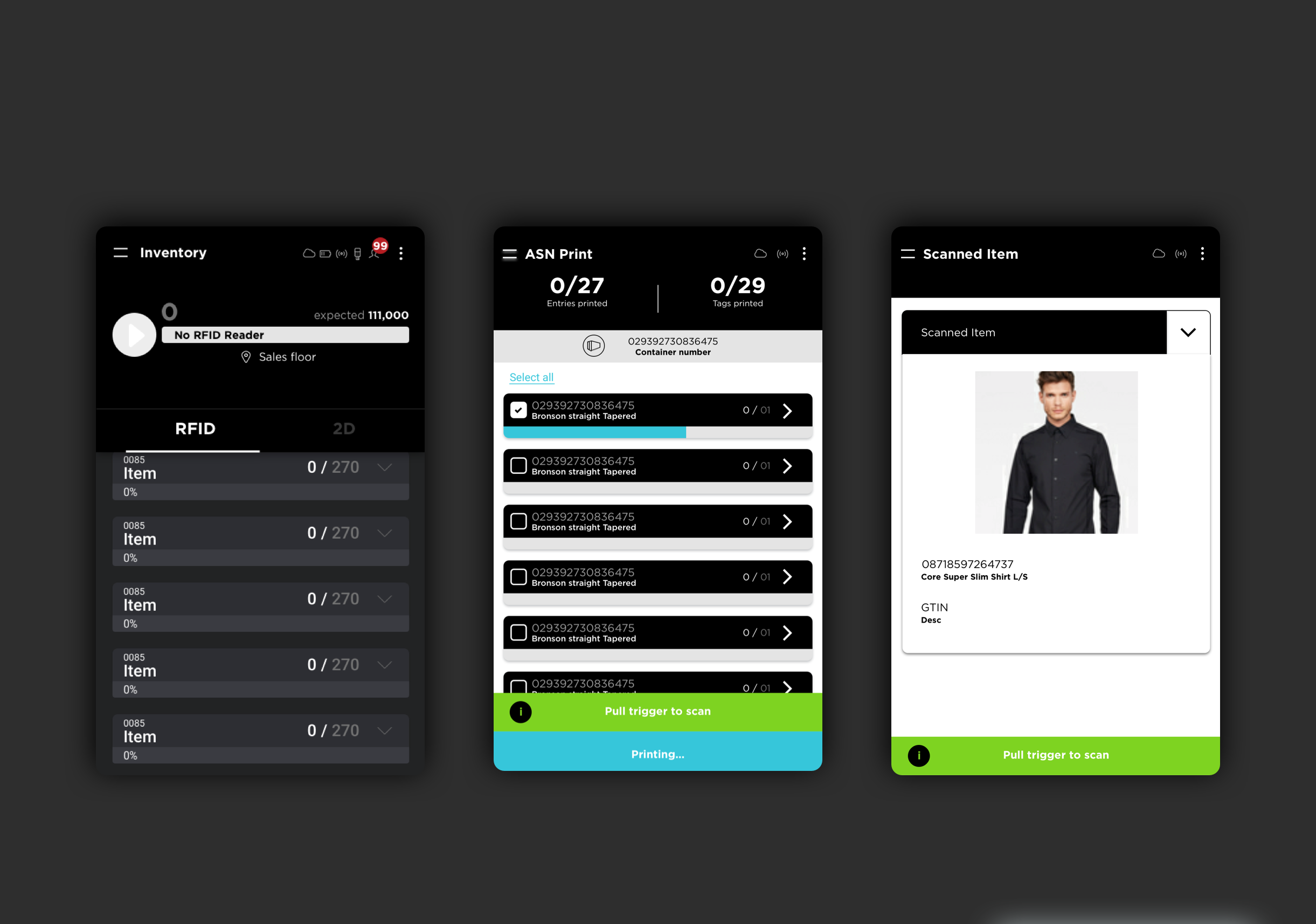
RIOT Insight uses RFID to help retail teams count, locate and reconcile stock. The company had been in the space for some time and wanted the in-store device experience rebuilt.
Context of use defined this project. The product is not used at a desk — it is used while walking a floor, between customers, often by staff who rotate through the task infrequently. Anything that requires interpretation costs time the user doesn't have.
The redesign focused on legibility, task priority and making system status unambiguous at a glance.
My Role
Solo UX/UI Designer. Solo designer on the project, responsible for end-to-end UX and UI — covering in-store task analysis, information architecture, interaction design, Material Design adaptation and the back-office dashboard interface.
The challenge
The previous system was not user friendly. The UI was difficult to interpret, and the text was even more difficult to read.
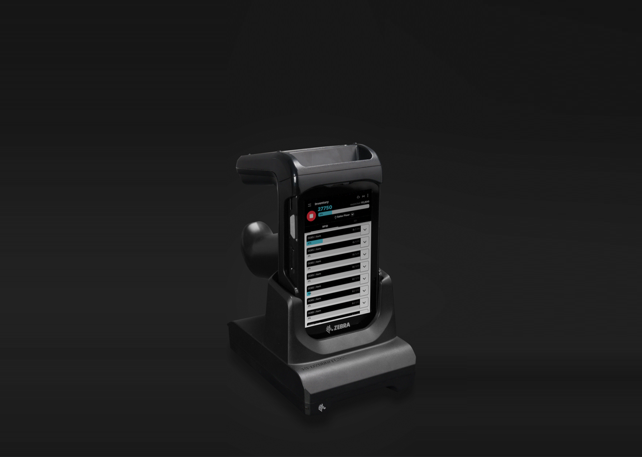
The UX approach
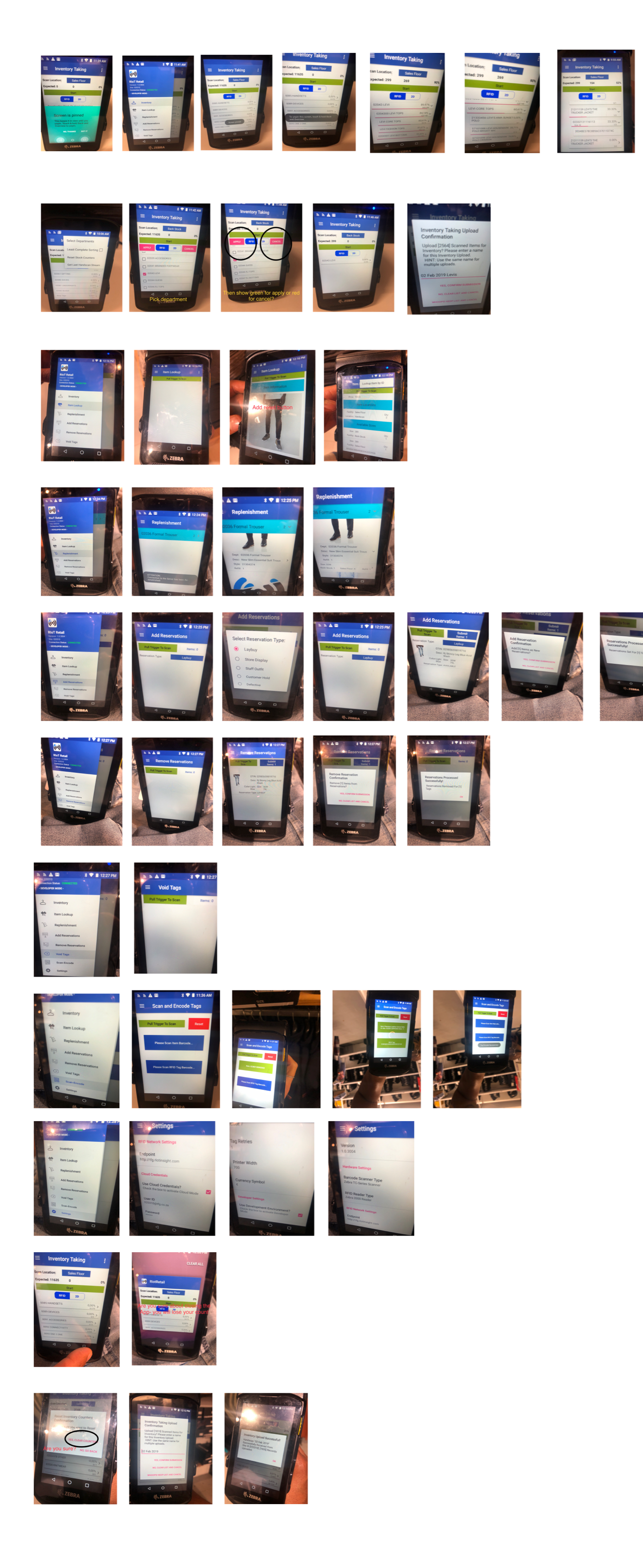
We took inventory of every existing screen and re-ranked them by how often the task is actually performed in store. Counting, locating and checking a discrepancy became the primary surface; configuration and reporting moved back into the dashboard where there is time and a larger screen.
Scanning is a live process, so the interface reports continuously — what the device is doing, how far through a count it is, what has been found and what is still missing. Making system status legible removes the main source of uncertainty in RFID work, which is not knowing whether the absence of a result means 'nothing there' or 'not finished'.
Detail is progressively disclosed. A count resolves to a single number and a state; drilling in reveals item-level data only when the user has a reason to ask for it. That keeps cognitive load on the task rather than on the tool.
The process
- 01
Take inventory of all the existing screens on the platform.
- 02
Explore UI trends that would be useful for this exercise.
- 03
Land on Material Design as a guiding framework.
- 04
Apply and test.
The UI approach
Material Design was adopted as the framework — a deliberate choice for a device product, because its conventions for elevation, state and feedback are already familiar to Android users and remove ambiguity we would otherwise have had to invent.
Type sizes and contrast were raised well above desktop norms to survive being read at arm's length under retail lighting. Touch targets were sized for quick, imprecise taps. Colour is restricted to status — found, missing, in progress, error — so it never decorates.
The system was aligned to the company's concurrent rebrand and extended to the back-office dashboard, so store and head office read the same data through the same components.