[ 011 ]
RMB Innovation Hub
Client
RMB
Year
C. 2016
Discipline
Web
Brand
Status
Delivered
The RMB Innovation Hub needed a digital presence that could explain a wide and evolving set of initiatives, projects and partnerships, while sitting credibly inside an established financial institution.
Innovation programmes are difficult to communicate because they are plural by nature: several audiences, several kinds of activity, no single narrative. The design problem was structural before it was visual.
My Role
Solo UX/UI Designer. Solo designer on the site, handling UX and UI end to end — including content modelling, audience pathways, modular components and the final visual language.
The UX approach
Content is organised by what a visitor is trying to establish — what the Hub does, what it has built, and how to engage with it — rather than by internal programme names. Each audience has a legible entry point without the site fragmenting into separate microsites.
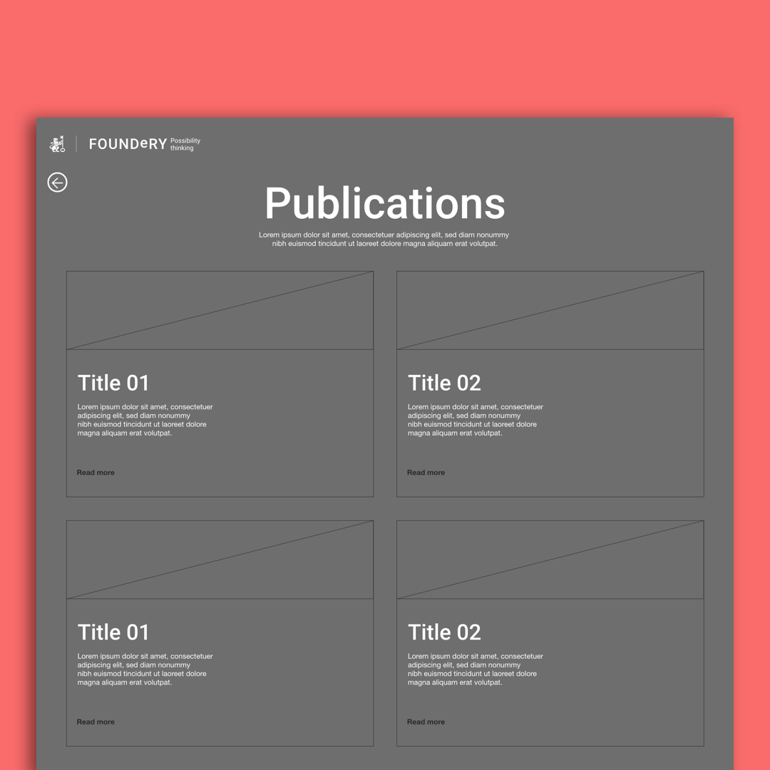
Initiatives and projects share a consistent content model, so a reader who understands one understands all of them, and new work can be published without redesigning the page it lands on. Hierarchy within each page moves from purpose to detail, letting a scanner and a reader both leave with something.
The UI approach
The visual language leans on strong typography, a clear grid and considerable whitespace — progressive in feel, but restrained enough to read as part of RMB rather than a departure from it. Brand connection is maintained through colour and tone rather than direct replication.
Modular content components keep long-form explanation, project summaries and calls to engage visually distinct and consistently placed across the site.