[ 004 ]
ABSA BUSINESS BANKING PORTAL
Client
Absa
Year
C. 2017–2018
Discipline
Product
Web
Dashboard
Status
Delivered
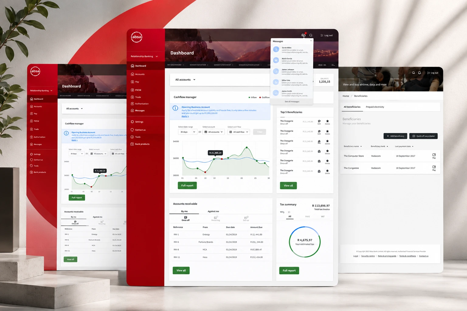
Absa set out to improve its business banking offering with a digital environment built specifically around small and medium-sized businesses — customers who are simultaneously the finance function, the operations function and the person doing the work.
For that user, a banking portal isn't a place to transact; it's one of several tools used to keep a business running. The design problem was to treat it that way: organise around what the business is trying to do, not around which division of the bank owns the capability.
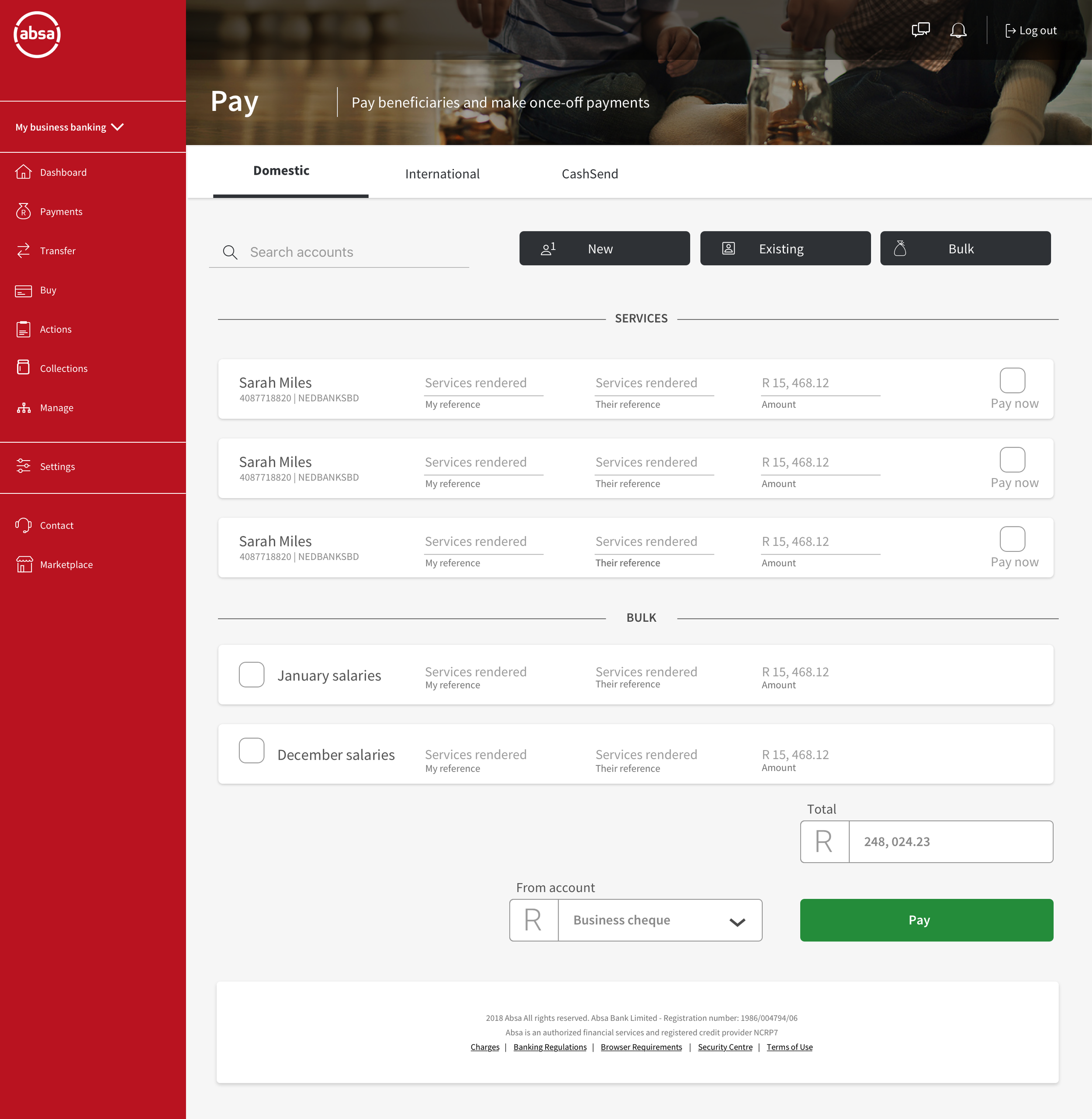
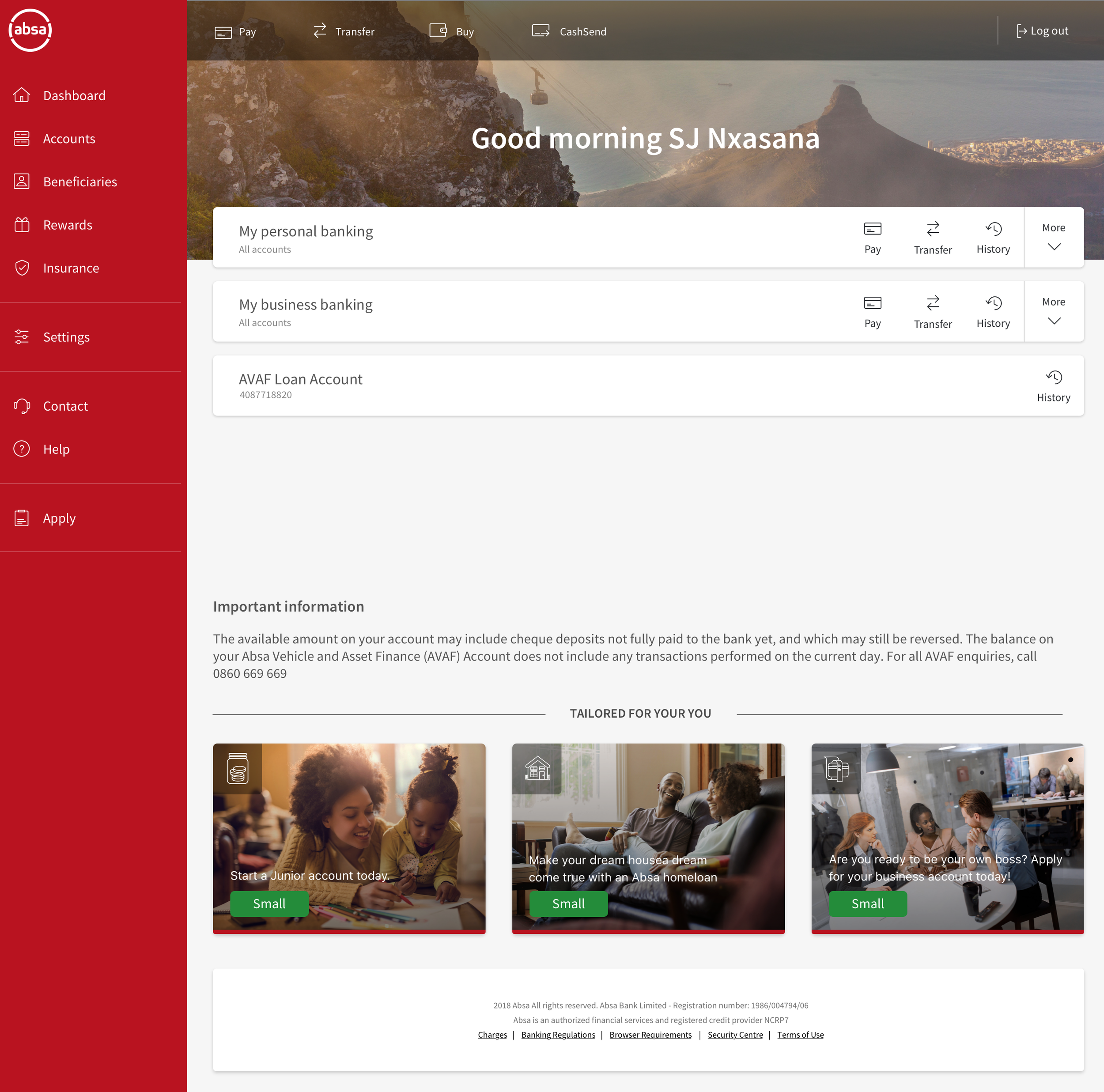
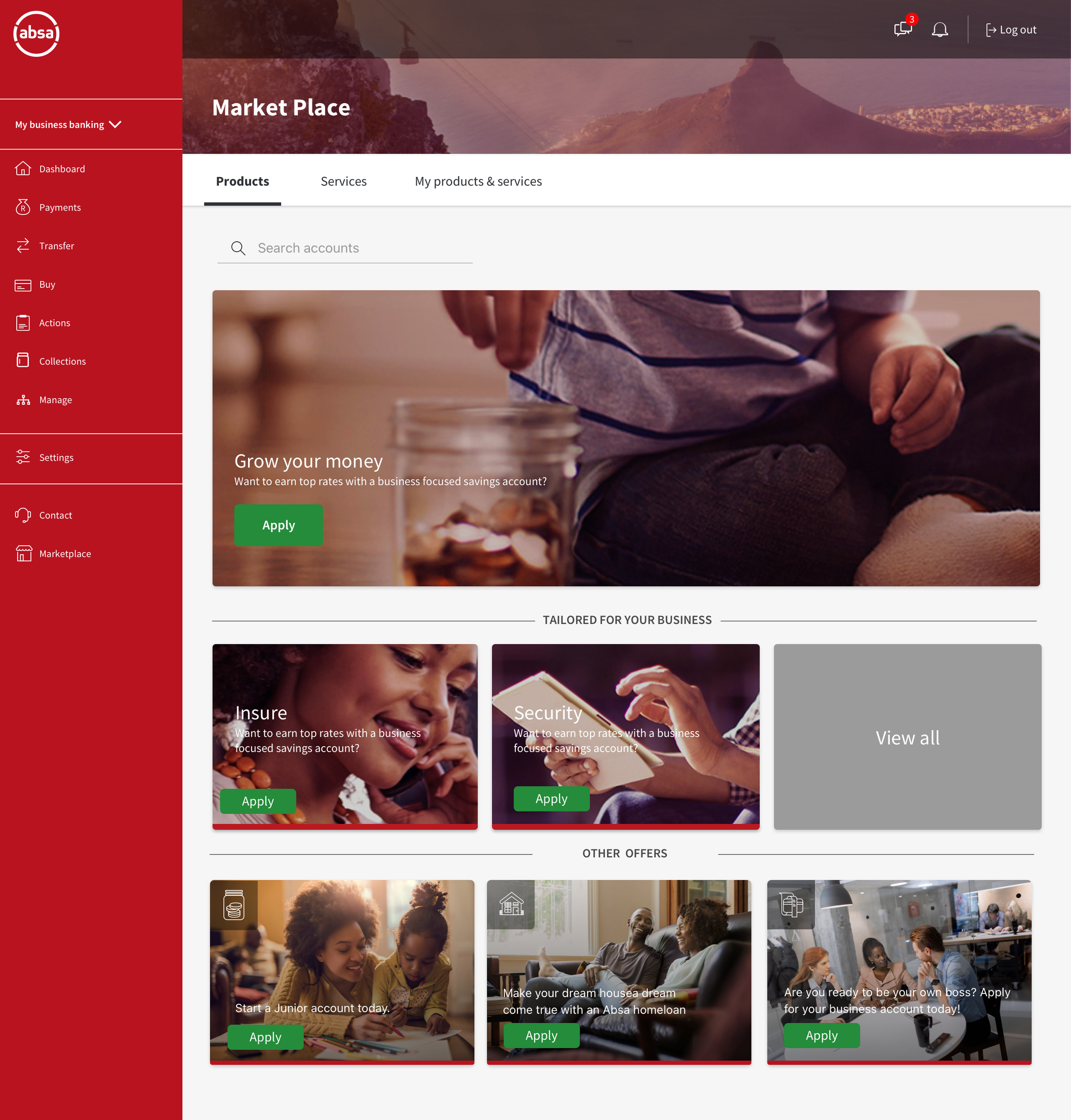
The work spanned account opening, a post-onboarding dashboard, everyday payments and a marketplace of products and services, across desktop and mobile.
My Role
Solo UX/UI Designer. Solo designer on the portal, leading UX and UI from discovery through to final execution — including the account-opening journey, dashboard architecture, payments flows and mobile adaptation.
The challenge
Help business customers start, operate and grow their businesses through the bank's channels — without exposing the organisational complexity behind those three very different jobs.
Onboarding alone carries a decision tree of entity types, ownership structures and product eligibility that a customer has no reason to understand.
The UX approach
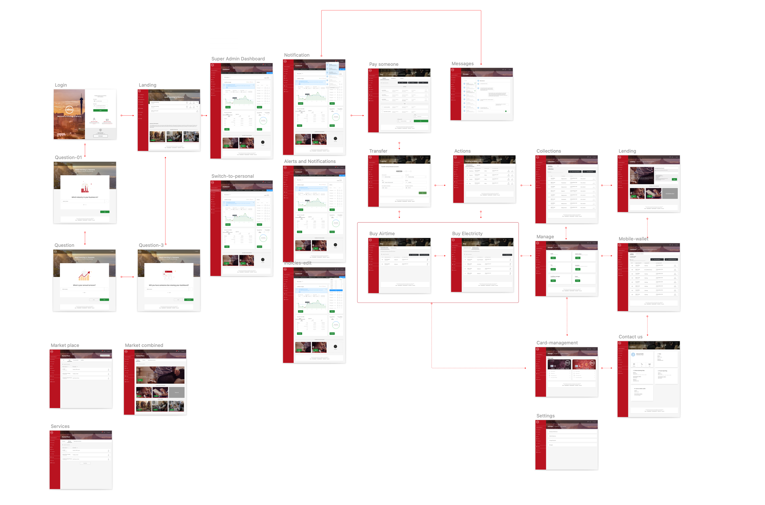
We built the account-opening journey on a decision tree defined up front, so the interface asks only the questions that remain relevant given what has already been answered. Eligibility logic runs behind the screen; the customer experiences a short, linear path with clear status at each step rather than a long conditional form.
The information architecture is framed by business task — money in, money out, position, growth — rather than by product line. Accounts, cards, payments and facilities are presented in their working relationships, so the customer can see what a given action affects before committing to it.
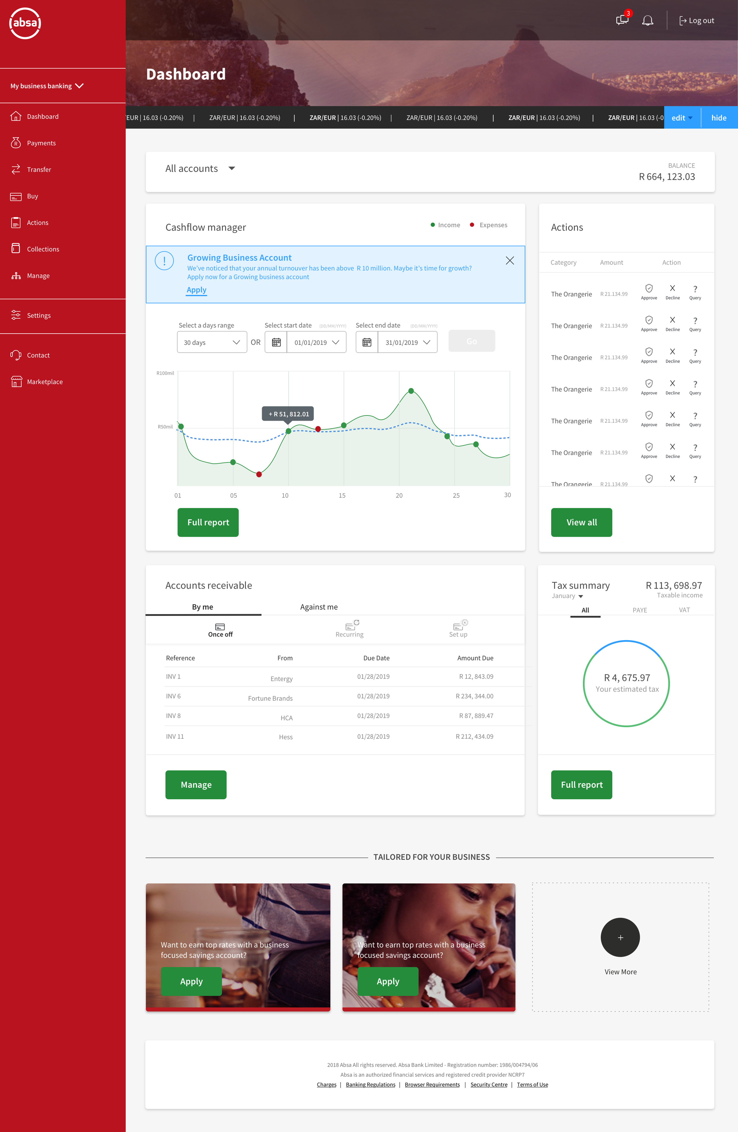
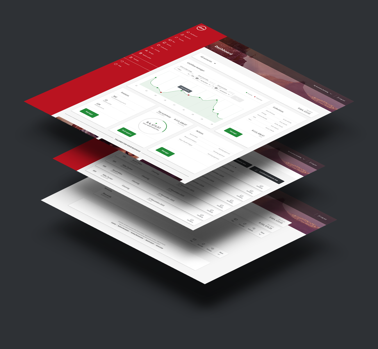
The dashboard is prioritised by decision value: position and anything requiring attention resolve first, routine actions sit within immediate reach, and analysis and product discovery are progressively disclosed beneath. Suggestions for additional products are anchored to the business's own goals and activity, which makes them discoverable in context instead of appearing as advertising.
The UI approach
A modular card grid carries the dashboard, letting density adapt to the size and complexity of a business without a bespoke layout for each. Typographic scale, not chrome, establishes what matters: figures dominate, labels recede, secondary data is available but visually subordinate.
Colour is reserved almost entirely for state and category — attention, direction of money, product family — so it retains meaning in a data-heavy screen. Data visualisation is kept plain and comparative rather than expressive, because the question being asked is usually 'more or less than before'.
The mobile experience is a deliberate subset rather than a compression: the actions an owner needs away from a desk, using the same components and hierarchy so the two contexts stay recognisably one product.