[ 010 ]
CELL C’S TOWNSHIP ECONOMY ECOSYSTEM
Client
Cell C
Year
C. 2021
Discipline
Product
IoT
Mobile-first
Status
Delivered
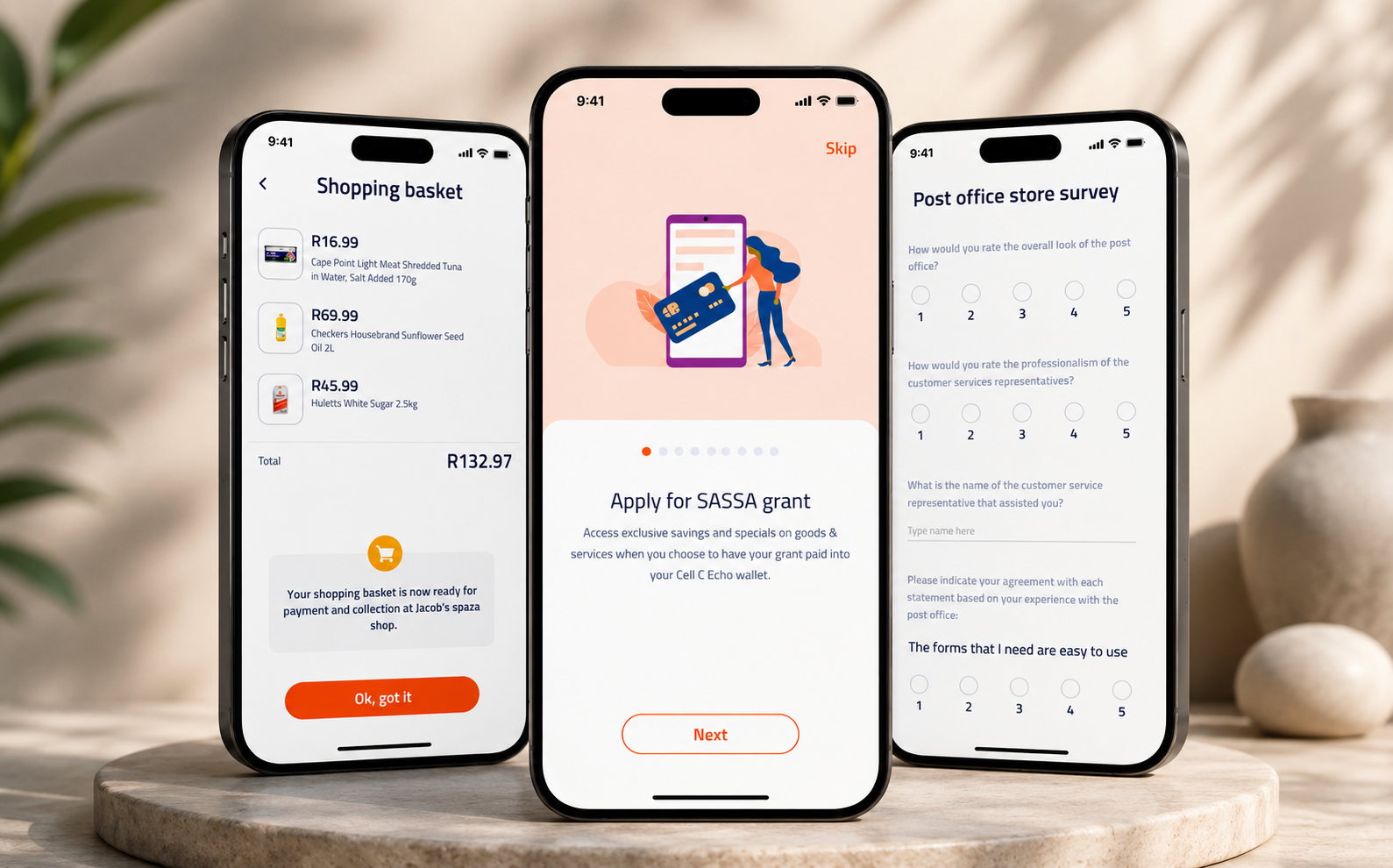
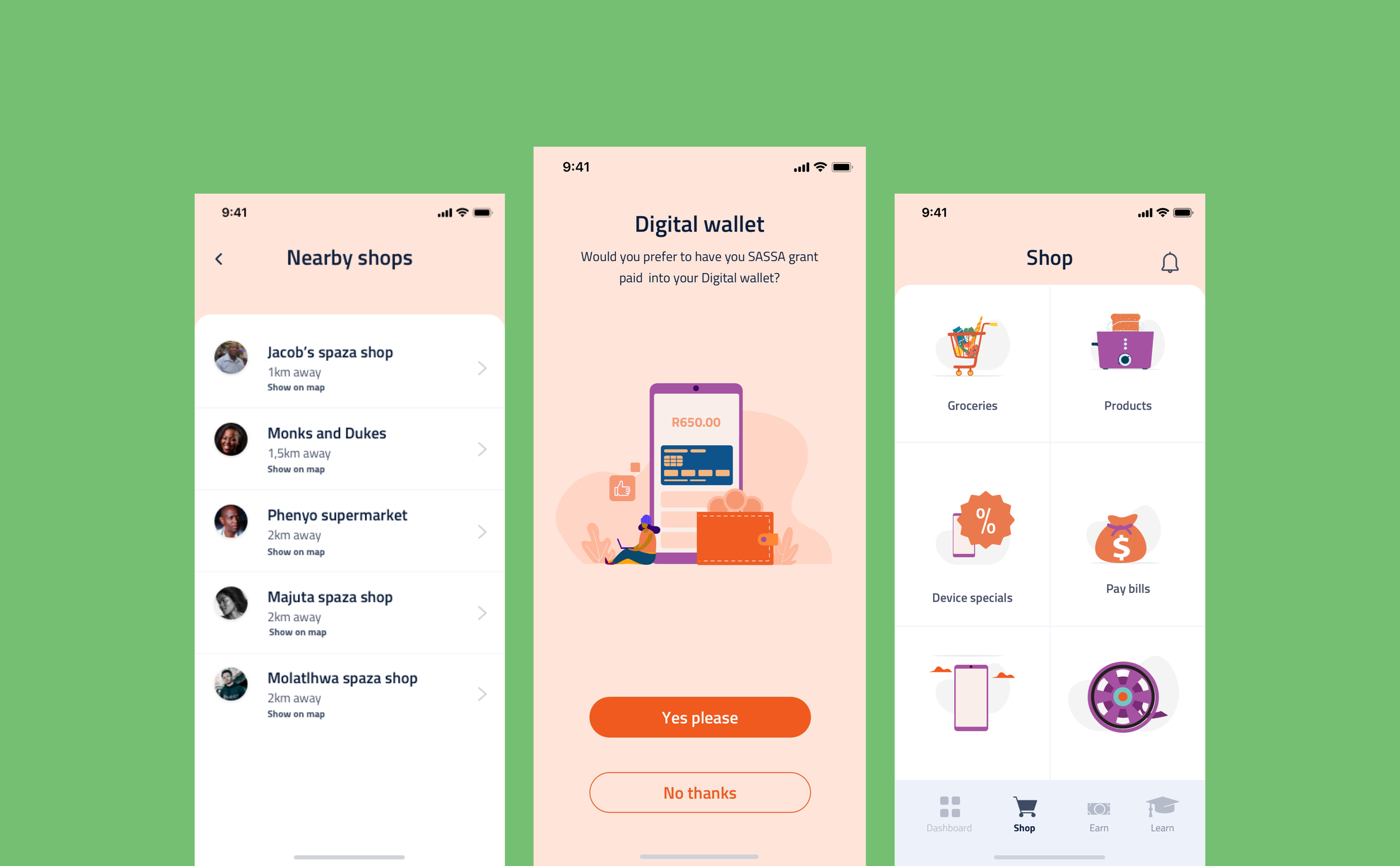
Cell C explored how a digital platform could connect young people in South African townships with short-term work and micro-jobs. The challenge extended well beyond individual screens: it required designing the relationships between job providers, workers, tasks, verification and payment.
The platform functions as a local marketplace — surfacing tasks available nearby and enabling people to earn money or airtime — with IoT used to streamline allocation, progress tracking and compensation, and to support trust between the two sides.
Given high mobile penetration in these communities, the product was designed mobile-first for a user base with widely varying digital literacy and data budgets.
My Role
Solo UX/UI Designer. Solo designer on the ecosystem, leading UX and UI end to end — including mobile-first task flows, opportunity discovery, status communication and the final interface for a wide range of digital literacy.
The problem
Townships, marked by historical socio-economic disadvantage, contend with limited access to quality education, scarce employment and inadequate infrastructure. Young people frequently face barriers to entering the formal job market — skills mismatches, lack of professional networks and systemic bias.
Local economic activity may not be developed enough to absorb the growing number of young job seekers, producing high unemployment and underemployment, intensified by rapid urbanisation and population growth.
The UX approach
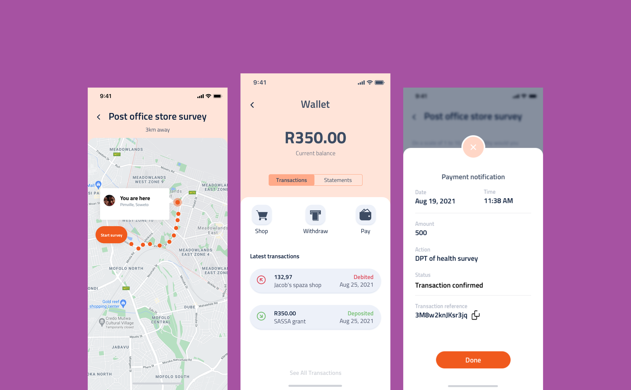
Discovery leads. The first screen answers what work is available nearby, right now, with pay and duration stated on the listing itself — the three facts that determine whether someone acts, visible before any tap.
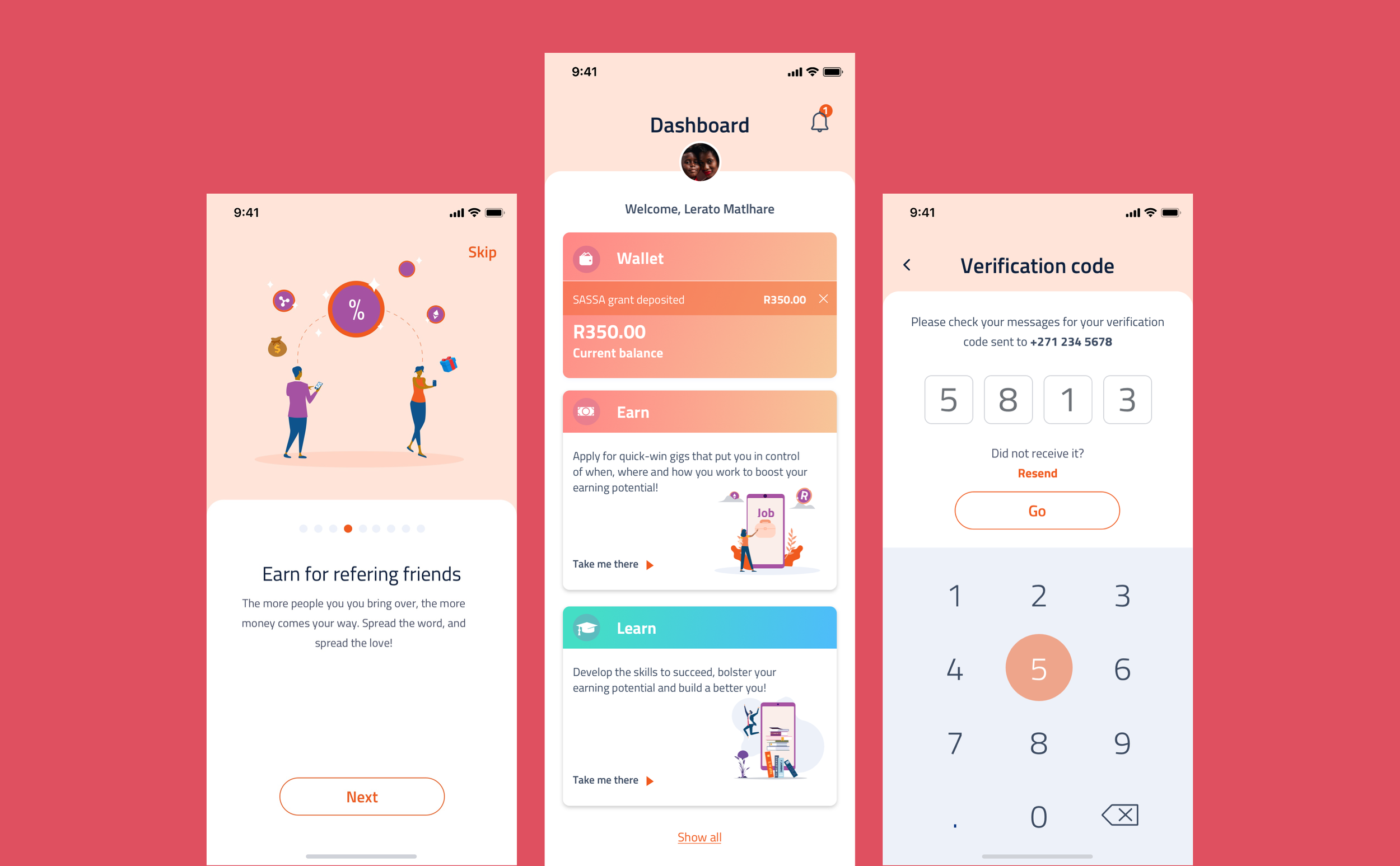
The distance between finding an opportunity and acting on it was compressed as far as the model allows. Onboarding asks only what is needed to apply for a first job and defers the rest, because a lengthy sign-up in front of an unproven product is where this kind of platform loses its users.
Trust is a design surface on both sides. Task status is communicated explicitly at every stage — applied, accepted, in progress, completed, paid — so neither party is left guessing about money or obligation. Language is plain, iconography is literal, and no step depends on prior familiarity with app conventions.
The approach
- 01
User research: understand the needs, preferences and technological capabilities of township youth so the platform is tailored to their context.
- 02
Create personas to base the journeys on.
- 03
Simplified design: a clean, straightforward interface that makes finding, applying for and completing micro-gigs effortless.
- 04
Mobile optimisation: built for smartphones, the primary way many users access the internet.
- 05
Engagement features: interactive elements and gamification to motivate regular participation and loyalty.
The UI approach
The interface is built for small, mid-range devices: large targets, high contrast, one primary action per screen and type sized to stay legible outdoors. Opportunity cards use a fixed structure so pay, location and time always appear in the same place and can be compared at a glance.
Status is carried by colour and label together rather than colour alone, and progress through a job is shown as a single, always-visible state. Imagery is used sparingly, keeping the experience workable on constrained connections.