[ 001 ]
Impact Farming
Client
Fedgroup
Year
C. 2016
Discipline
Product
Mobile
Design System
Status
Delivered
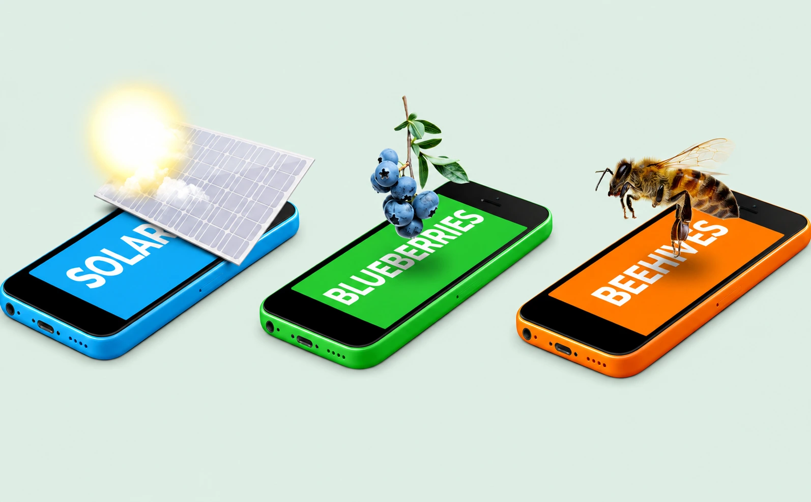
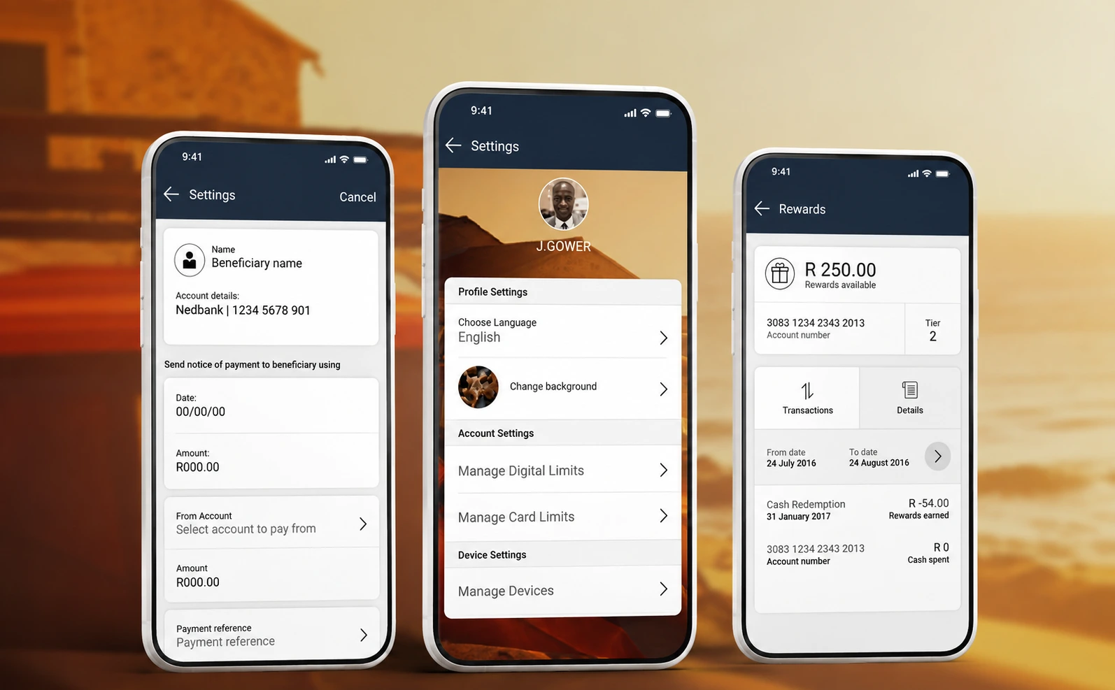
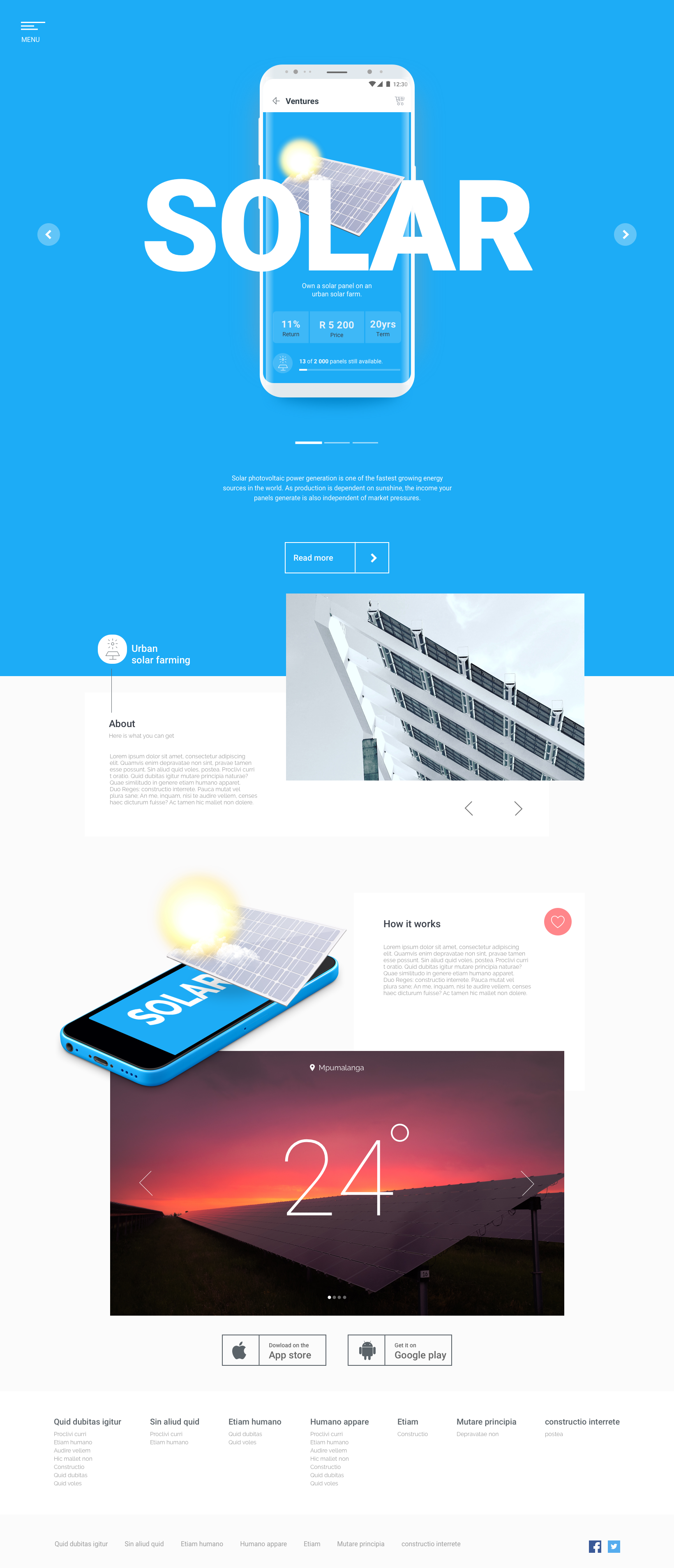
Fedgroup briefed us to design an investment app that functions and looks nothing like a conventional investment product. Impact Farming lets people invest directly in real agricultural assets — beehives, blueberry bushes, solar panels — which meant the central design problem was comprehension, not transaction.
Most investment interfaces assume the user already holds the mental model: units, yields, terms, risk. Here the asset is physical and unfamiliar as an investment, so the experience had to build understanding before asking for commitment.
The product resolves into two demands held in tension — the credibility expected of a financial platform, and the tangibility of the thing being bought.
My Role
Solo UX/UI Designer. Solo designer on the project, responsible for end-to-end UX and UI — from early research and investment-product modelling through user flows, interaction design, visual language, prototyping and final interface delivery across iOS and Android.
The challenge
Build a visually distinctive interface that translates cleanly across Android and iOS, across a portfolio of products that each needed to read as its own asset while sharing one visual language.
The harder half of that brief was structural: a first-time investor and a returning one need different things from the same screen. Discovery has to explain; ownership has to report.
The UX approach
We separated the experience into two mental modes — considering an asset, and holding one — and let the information architecture follow that split rather than mirroring Fedgroup's internal product taxonomy.
Investment concepts are introduced progressively. Each asset opens on what it is and how it produces a return, with the mechanics, terms and projections layered beneath rather than presented as a single dense disclosure. Cost, term and expected yield stay in a consistent position across every product, so comparison is recognition rather than recall.
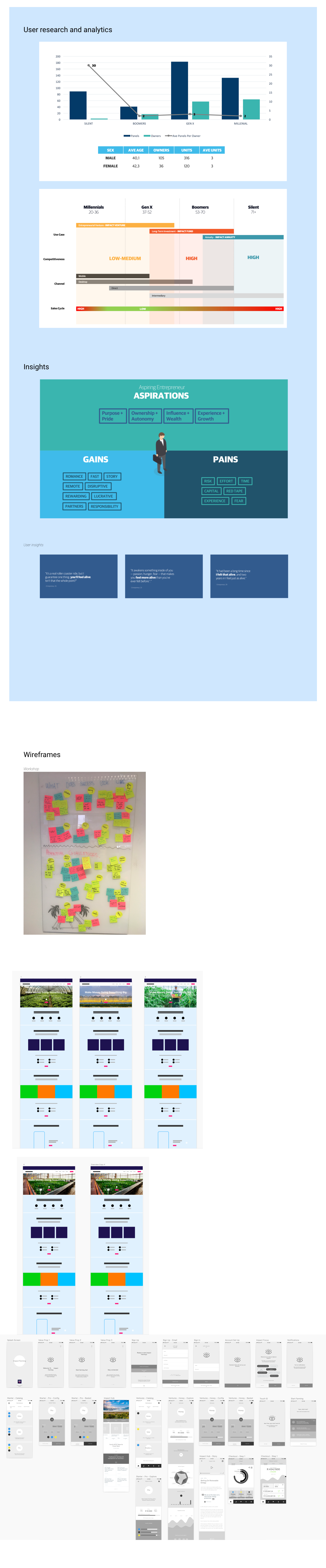
Interviews with prospective users were used to sense-check the language and the mental models people brought to alternative investment, alongside a journey-mapping session with internal stakeholders to establish where the decision points actually sat.
The process
- 01
Analyse the existing market in terms of LSM and current user behaviour. Interviews were conducted to get a sense of our users' mental models and to validate assumptions.
- 02
Study UX and UI trends.
- 03
Run a journey mapping session with internal stakeholders.
- 04
Create a mood board of how the interface should look and feel.
- 05
Apply and test.
The UI approach
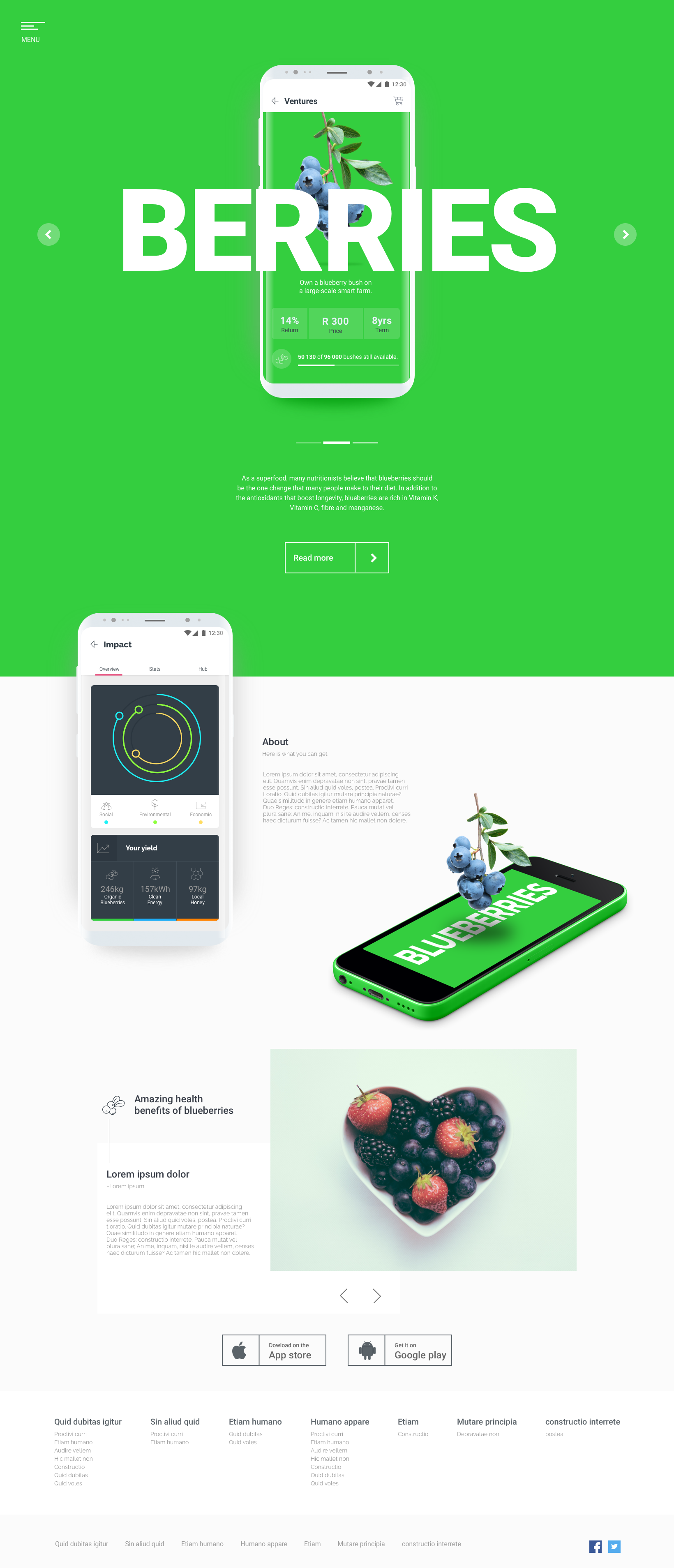
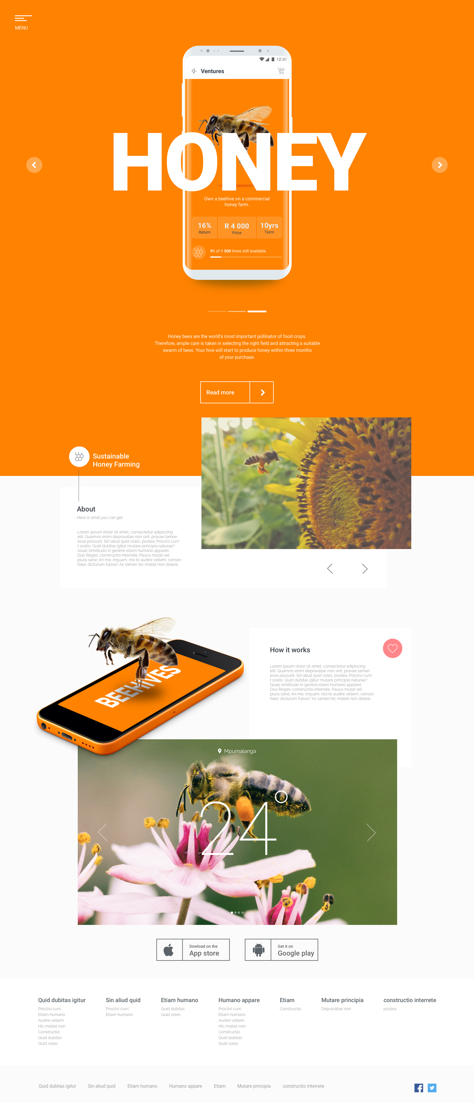
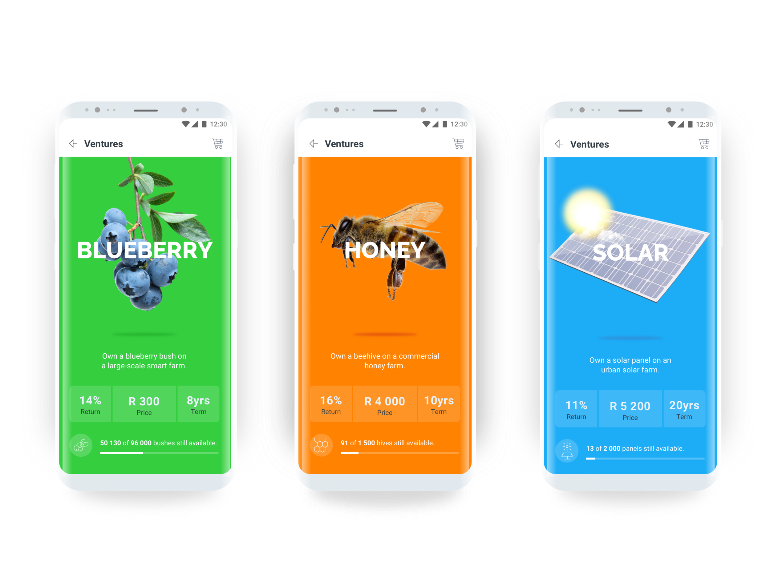
Colour carries the product hierarchy. Each asset owns a hue — pure, warm and saturated — so users identify where they are before reading a word, while type, spacing and component structure stay identical across products. Differentiation happens in colour; consistency happens in everything else.
Macro photography of the actual asset sits against those colours, giving the investment a physical referent that a chart cannot provide. Numbers are set in a restrained, tabular hierarchy so the financial content reads as precise, not promotional.
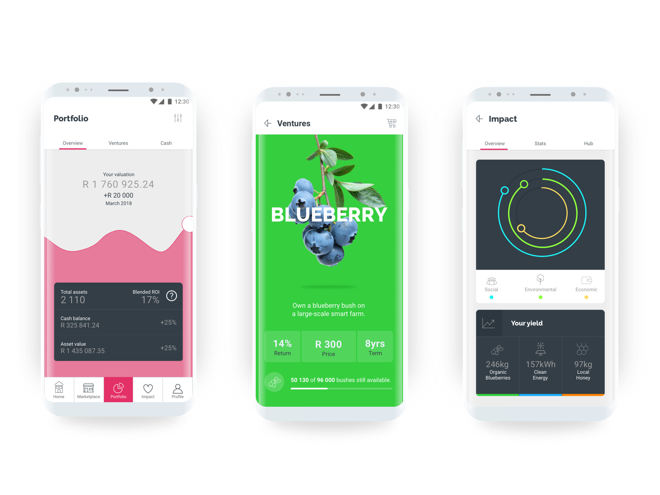
The whole interface is componentised — cards, asset headers, value rows, state indicators — which let the range grow without the design fragmenting, and kept parity between Android and iOS builds.
The result
An investment app that reads as a catalogue of real things rather than a ledger. The Fedgroup app went on to sit at number one on both the Apple and Android stores for several months.