[ 002 ]
ABSA MOBILE BANKING APP
Client
Absa
Year
C. 2014
Discipline
Product
Mobile
Design System
Status
Delivered
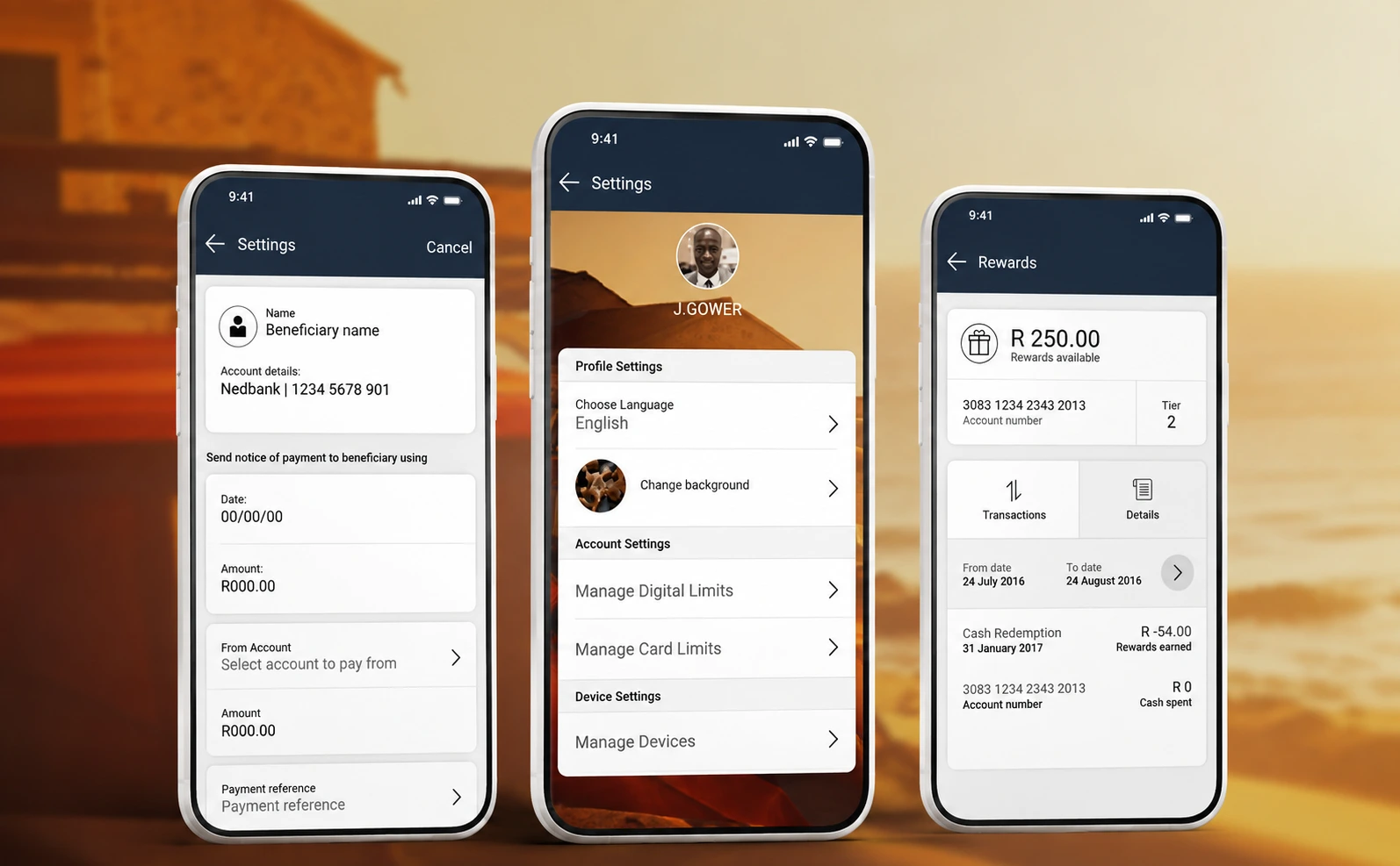
As part of Absa's broader transformation of its digital channels, the mobile banking app was rebuilt around a simple observation: a small number of tasks account for most of what customers open the app to do, and everything else was competing with them.
Retail banking is an unusually wide product surface — payments, transfers, cards, statements, servicing, applications — and each new capability had historically been added as another destination in the navigation.
The work was as much about establishing a system that could absorb the bank's future features without degrading as it was about the screens shipped at launch.
My Role
Android UI Lead Designer. Led the Android UI design for the ABSA Mobile Banking App, working closely with the UX team to translate user journeys, interaction patterns and product requirements into a cohesive Android interface and visual experience.
The challenge
Design an app usable by a large existing customer base with established habits, and by new customers with none — across iOS, Android and Windows, delivered by separate engineering squads.
The UX approach
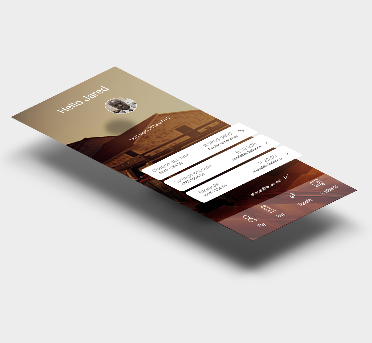
We reorganised the experience around task frequency rather than the bank's product structure. Balance, pay, transfer and recent activity resolve on entry; lower-frequency servicing tasks sit one deliberate level deeper. That reduced the amount of navigation required to reach everyday actions and kept the home screen answering the question most people open the app to ask.
Journeys were made consistent rather than individually optimised: pay, transfer and buy share the same sequence — recipient, amount, confirm, receipt — so learning one teaches the others. Confirmation and receipt states were treated as part of the design, not an afterthought, because in banking the system's account of what just happened is the product.
Existing customers were interviewed in branch and on the outgoing app, and a journey-mapping session was run with stakeholders, product owners, BAs and the platform squads to agree on those priorities before any interface work began.
The process
- 01
Conduct user interviews with banking app users in branch and on the old banking app.
- 02
Study UX and UI trends.
- 03
Run a journey mapping session with internal stakeholders, product owners, BAs and engineering squads for Android, iOS and Windows.
- 04
Apply the user interface to screens.
- 05
Apply and test.
The UI approach
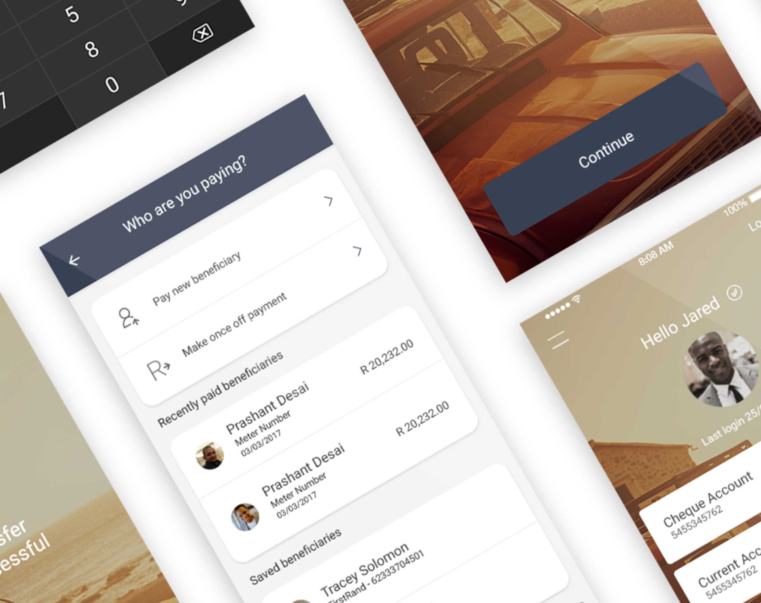
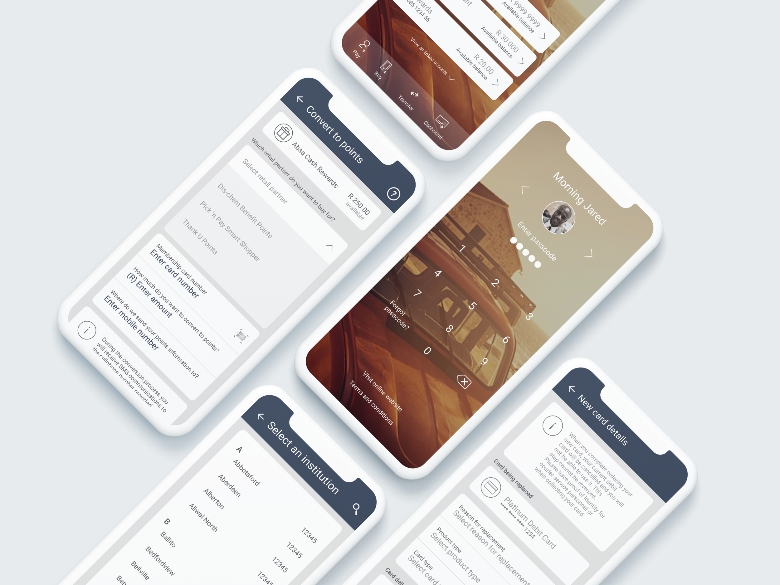
We introduced a card system into the UI library. Cards let us chunk a wide product set into units the user can scan and dismiss, and gave engineering a single scalable primitive: new capabilities enter the app as a card type rather than a new layout.
Typography does the hierarchy work — amounts set large and tabular, labels quiet, states carried by weight and colour rather than decoration. Spacing and grid are held constant across journeys so a screen the customer has never seen still feels familiar.
Components were specified with their interaction states and platform variations, respecting iOS and Android conventions while keeping the brand and structure identical across both.