[ 003 ]
What If
Client
What If Creative
Year
C. 2017
Discipline
Web
Art Direction
Illustration
Status
Delivered
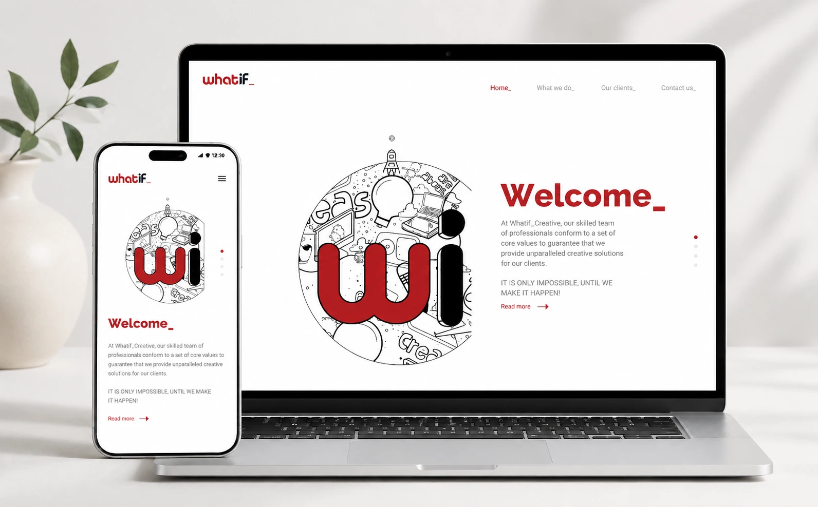
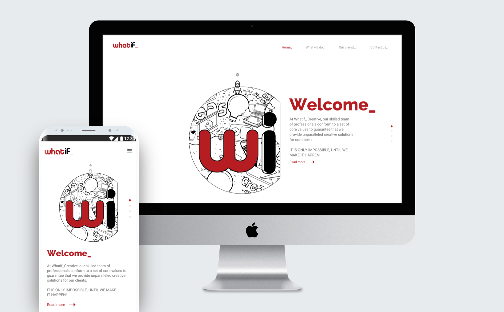
What If, a Johannesburg creative agency, needed a digital presence with more personality than the site it was replacing — without that personality getting in front of the portfolio it exists to show.
Agency sites tend to fail in one of two directions: so neutral they say nothing, or so expressive that every project ends up looking like the website rather than itself.
The brief was resolved by locating the energy in the brand elements and the structure, and keeping the frame around the work quiet.
My Role
Solo UX/UI Designer. Solo designer on the site, handling art direction, UX and UI end to end — including content structure, responsive composition, illustration integration and the final visual system.
The challenge
Build a responsive site that communicates what the agency is about visually — fun, energetic, striking — while remaining a neutral container for a portfolio of very different projects.
The UX approach
Navigation was kept deliberately shallow. Visitors to an agency site are browsing, not completing a task, so the structure supports scanning and lateral movement between projects rather than a funnel.
Content hierarchy is consistent across every case: the work first, context second. Each project is entered and exited the same way, so momentum through the portfolio is never interrupted by a novel layout.
Interaction is limited to what aids orientation — where you are, what is next — and the interface holds still while imagery is on screen.
The process
- 01
Identify key UX and UI patterns that can be leveraged to create a visually interesting website that is fun and energetic, so as to be more engaging to the audience.
- 02
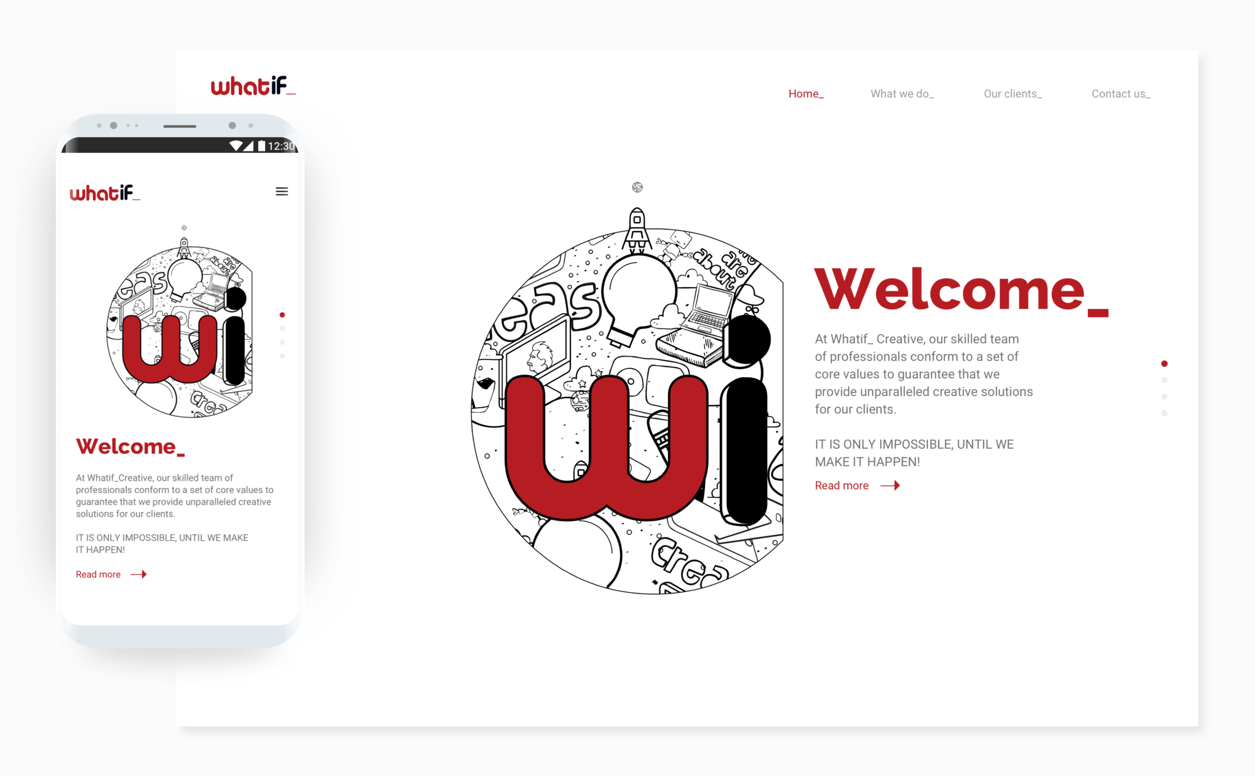
Develop an interface centered around the company's signature logo.
- 03
Prototyping.
- 04
Apply and test.
The UI approach
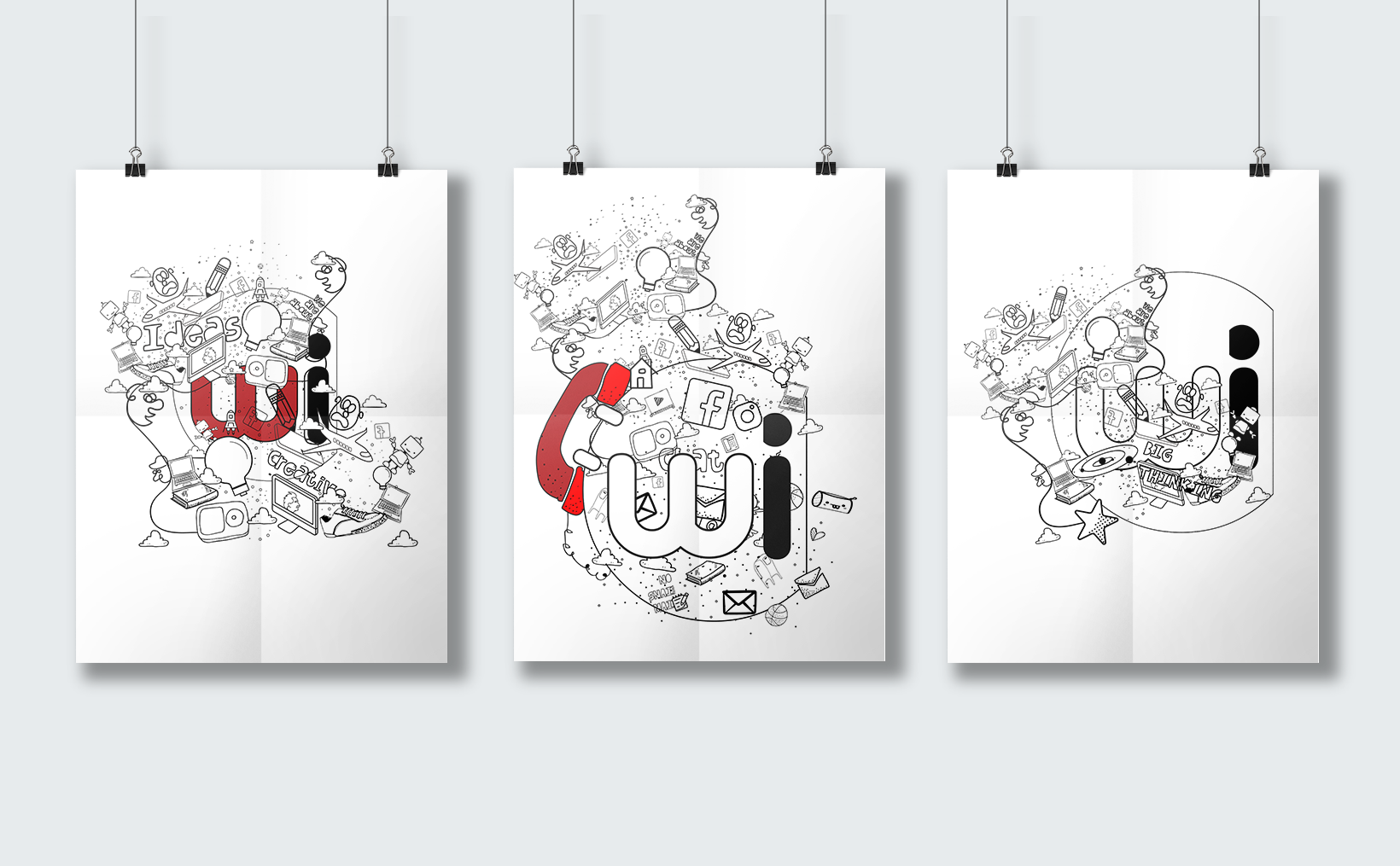
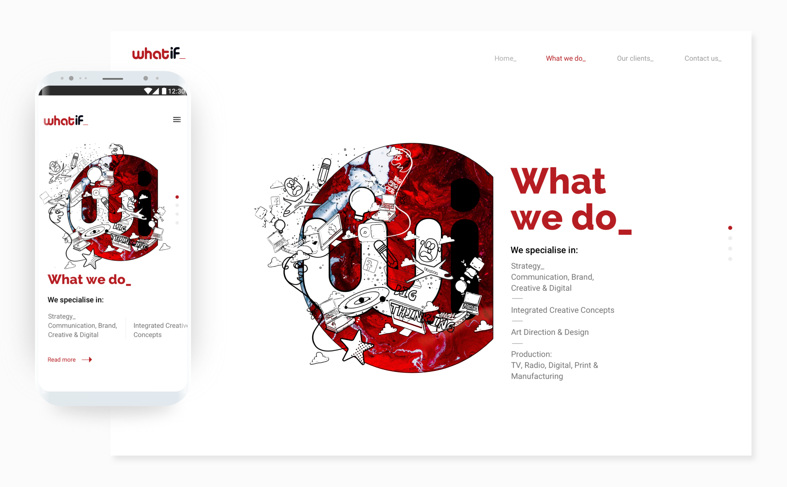
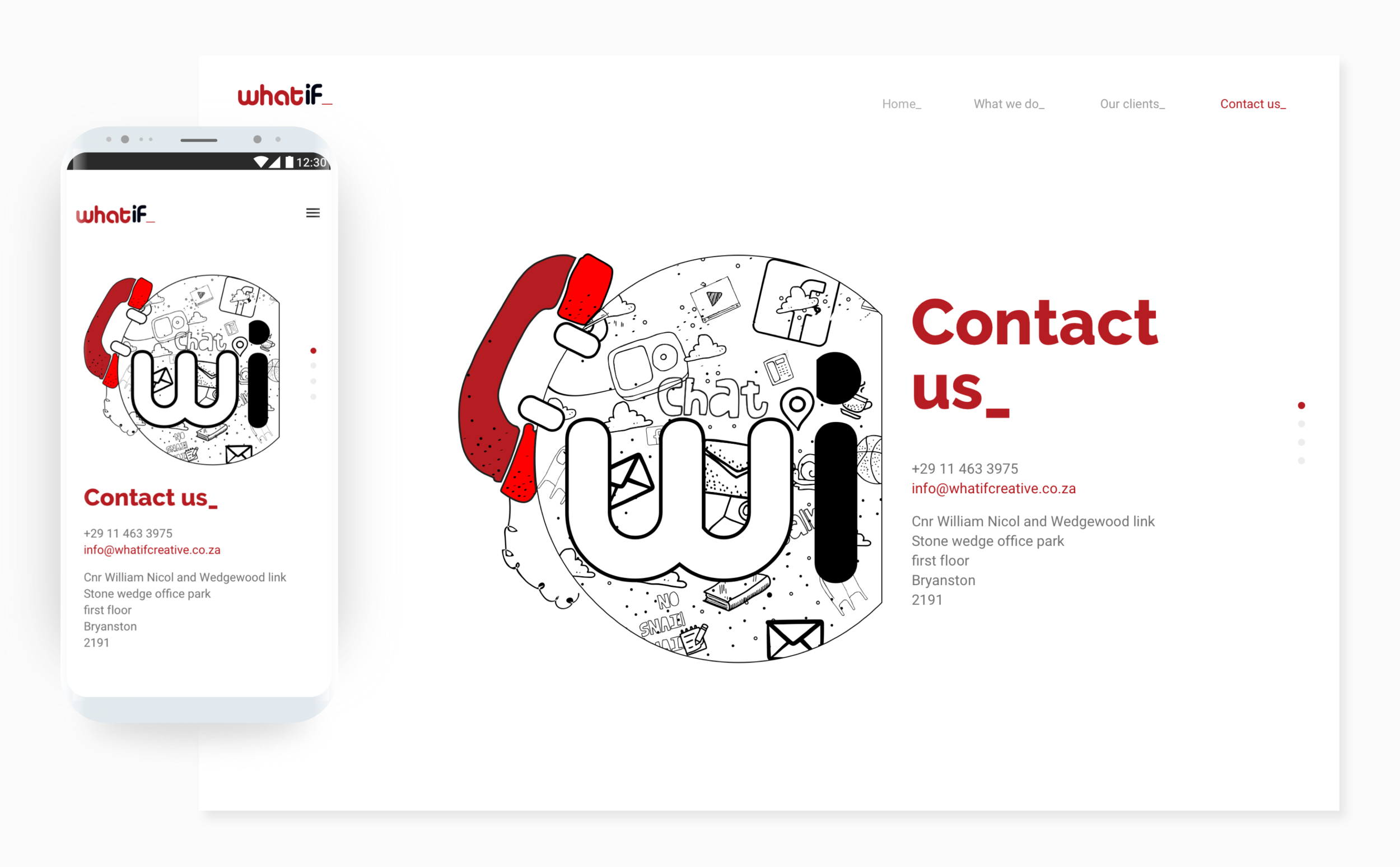
The interface is built from typography, generous whitespace and a grid that stays legible from mobile up, with the agency's signature logo as the organising device. Expression is concentrated in a set of illustrations covering the agency's capabilities, used at moments where no client work is on screen.
That division — illustration and type carry the personality, the project frames carry nothing — lets the site feel like the agency without colouring the work inside it.