[ 007 ]
Sales Advantage
Client
Sales Advantage
Year
C. 2022
Discipline
AI Product
Web
Data Viz
Status
Delivered
Sales Advantage helps small and medium-sized businesses work through dense financial and regulatory information — specifically SEC 10-Q and 10-K filings, documents written for compliance rather than comprehension.
AI is the mechanism here, not the proposition. The product's job is to move a user from several hundred pages to the handful of passages that matter, and to make it easy to check that the answer is sound.
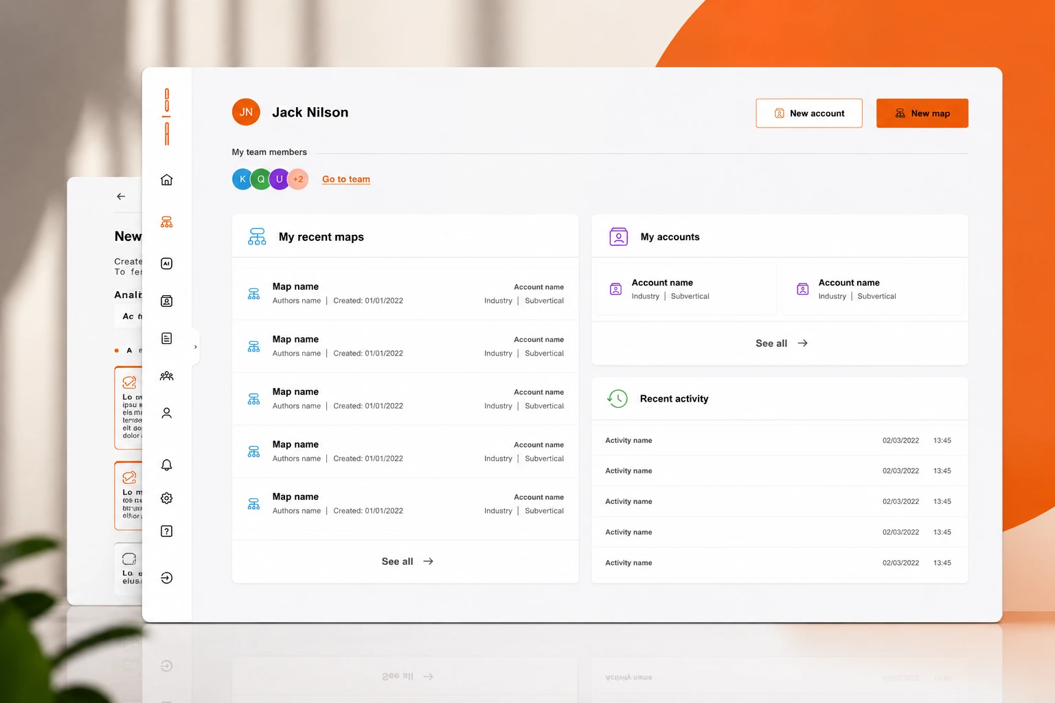
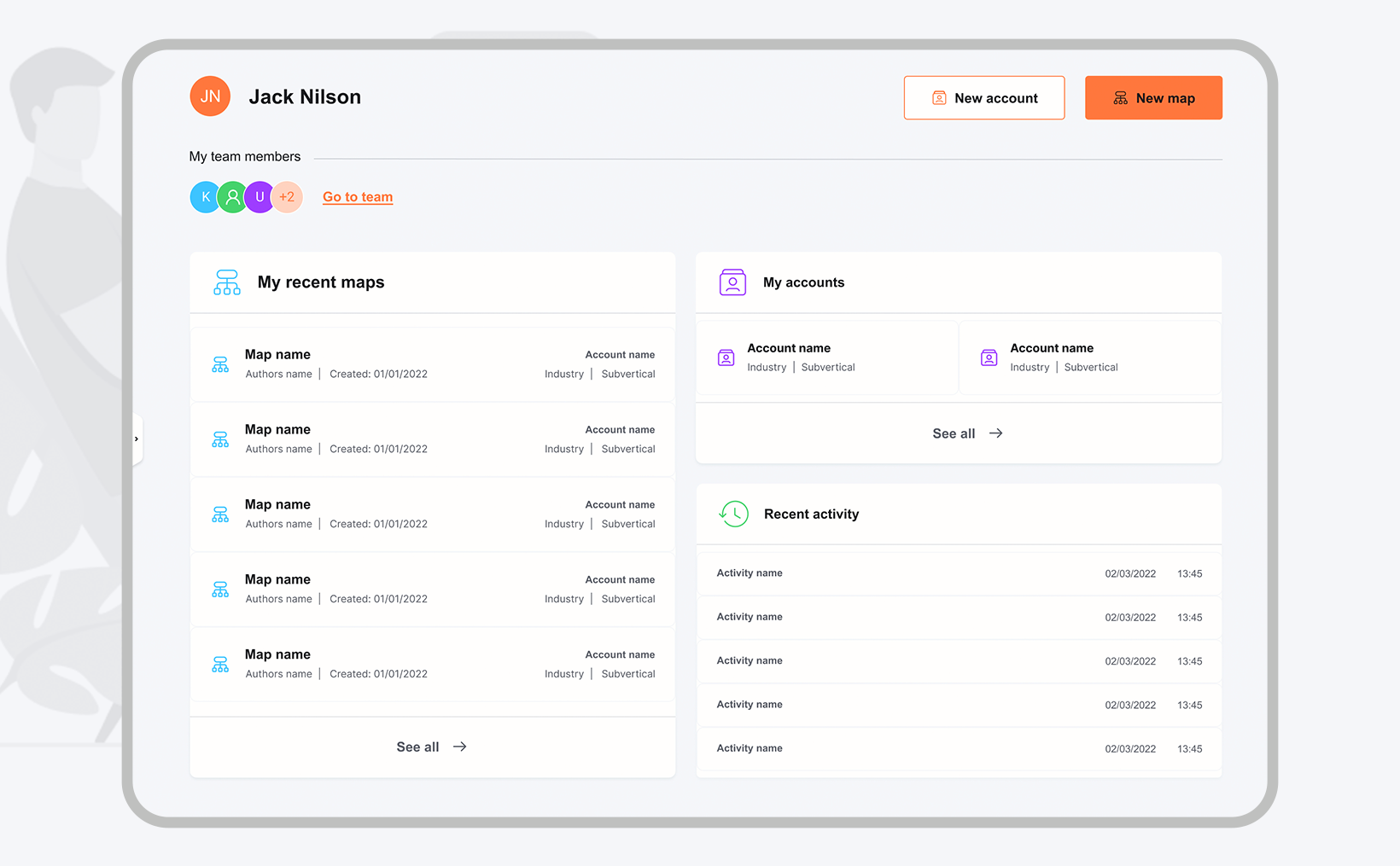
Alongside document analysis, the platform supports team collaboration, value proposition generation and interactive customer engagement maps.
My Role
Solo UX/UI Designer. Solo designer on the platform, leading UX and UI end to end — including query-first interaction design, source-provenance patterns, value-map visualisation and the final interface language.
The problem
Account managers encounter significant challenges when attempting to interpret and use the information contained in 10-Q (quarterly) and 10-K (annual) filings submitted to the SEC. These documents are crucial for informed financial and strategic decisions, yet their density and legal and financial jargon make them nearly impenetrable without specialised training.
The difficulty is not only volume. Critical nuances sit buried inside long narratives, and the stakes are high — a misreading can lead to a poor strategic decision, misallocated resources or a compliance issue.
The UX approach
The primary interaction is a query, not a reading interface. Users arrive with a question about a company, and the experience is structured to answer it and then let them widen or narrow from there, rather than asking them to navigate a document they didn't write.
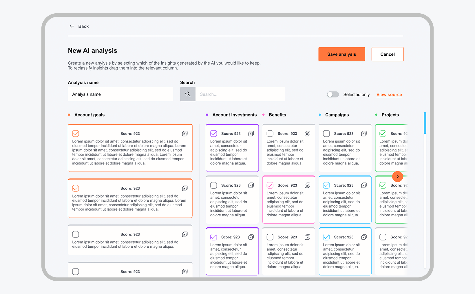
Every answer is anchored to its source. Provenance and surrounding context sit next to the output so a user can verify a claim before acting on it — the difference between a tool an account manager can defend in a meeting and one they cannot.
Information is layered: a summarised answer first, supporting figures beneath, full filing passages a step further in. Filters scope the analysis to particular sections or metrics, and alerts watch the numbers a user has said they care about, so returning to the product is a check rather than a search.
A first-run walkthrough introduces the query model, since the interaction is unfamiliar to people used to searching documents by keyword.
The approach
- 01
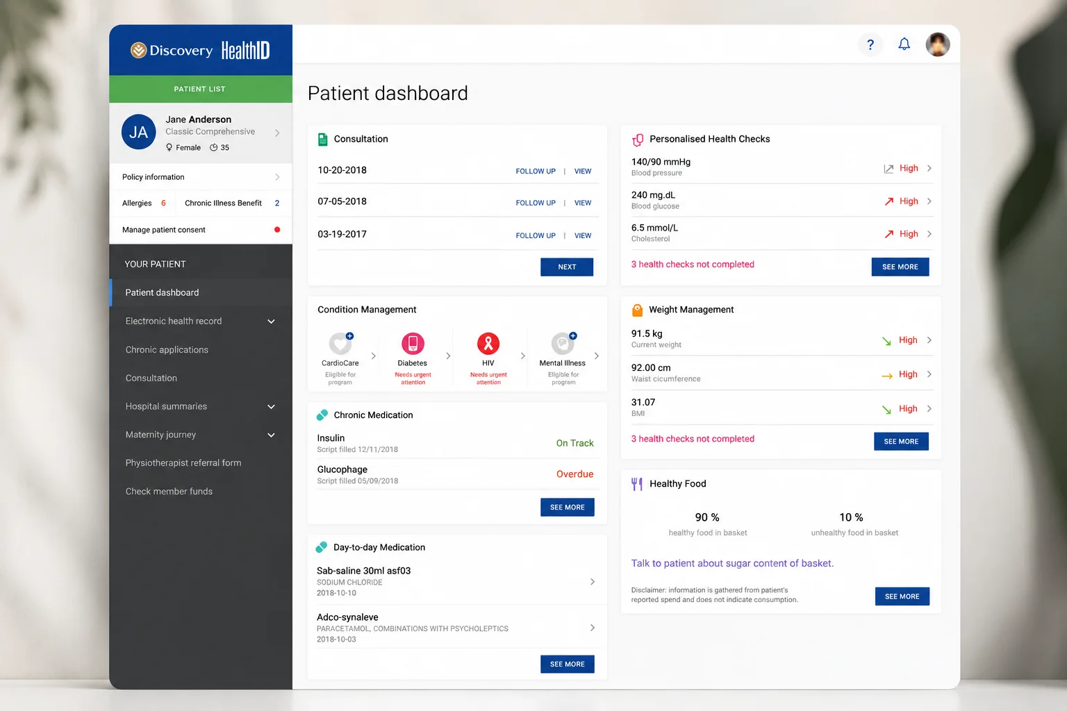
User-centric design: an interface that simplifies complex data through dashboard visualisations, summarised key points and interactive elements.
- 02
Customisation: filters to focus on specific report sections, and alerts for key financial metrics.
- 03
Guided navigation: a walkthrough for first-time users that reduces the learning curve.
- 04
Search functionality: robust querying of specific data or terms within documents.
- 05
Feedback loops: user feedback mechanisms that keep the interface improving over time.
The UI approach
Generated output is visually distinguished from source material, so the user always knows what is a system interpretation and what is the filing's own words. Typography carries the reading hierarchy — summary, evidence, detail — with whitespace doing the separation rather than boxes and rules.
Value maps and engagement maps are rendered as structured, navigable diagrams rather than static charts: the same information the analysis produced, arranged spatially so relationships between accounts, needs and propositions can be read directly.
Data visualisation is kept comparative and plain, and every visual element resolves to a figure the user can trace.
The outcome
The solution enabled account managers to generate value maps in 7.5 minutes — a task that would previously have taken weeks.